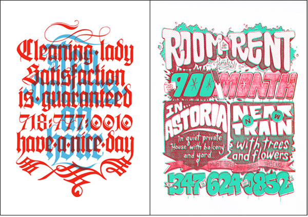
Cardon Copy

Jordan posted today about her friend Cardon Webb whose exhibition, Cardon Copy, is at the Type Directors Club right now in NYC. I loved the typography so much… I also noticed that some of the posters seem to be from my neighborhood in Queens!

From his mission statement: “Cardon Copy, takes the vernacular of self-distributed fliers and tear-offs we have all seen in our neighborhoods. It involves hijacking these unconsidered fliers and redesigning them, over powering their message with a new visual language. I then replace the original with the redesign in its authentic environment.”

Cardon Copy

Comments

One comment
  1. AshleyL.

    Very cool art! So bold and full of bursts of color!

    April 28th, 2009

Make a Comment

Priya is twenty-nine. She lives in New York City. She art directs advertising for a luxury jewelry brand. She loves fizzy lemonade, Ladurée macarons, Jean Schlumberger jewels, vintage fashion advertising, Audrey Hepburn movies and letterpressed paper. She also loves her work.

Archives by Month

  • 2014:
  • Jan
  • Feb
  • Mar
  • Apr
  • May
  • Jun
  • Jul
  • Aug
  • Sep
  • Oct
  • Nov
  • Dec
  • 2012:
  • Jan
  • Feb
  • Mar
  • Apr
  • May
  • Jun
  • Jul
  • Aug
  • Sep
  • Oct
  • Nov
  • Dec
  • 2011:
  • Jan
  • Feb
  • Mar
  • Apr
  • May
  • Jun
  • Jul
  • Aug
  • Sep
  • Oct
  • Nov
  • Dec


Colophon

I like to share the things that catch my eye. I hope you find as much inspiration in this as I do.

Love Made Visible was designed by me and coded by the fabulous Arun Kale and Stefan Pause. Typefaces used are Archer, Coquette, FF Meta Serif and Museo Sans.

Love Made Visible is a member of the Delightful Blogs Network.

Contact me or suggest a tip!