Tim Walker
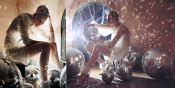
My boss showed me the Fotographie issue for fashion photographer Tim Walker and I immediately fell in love with his work. Glam, decay, fantasy, impressive lighting… it’s all there. See more of his work here.
Work from his portfolio.

My boss showed me the Fotographie issue for fashion photographer Tim Walker and I immediately fell in love with his work. Glam, decay, fantasy, impressive lighting… it’s all there. See more of his work here.
Work from his portfolio.
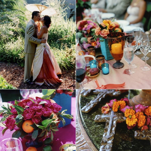
Namrita & Roman‘s wedding in California mixed the traditions of both of their heritages for a Mexican-Indian celebration that was truly stunning. This installment in Nirali Magazine, we bring you inside four real and stunning South Asian weddings plus, we’ve compiled guides on South Asian beauty and wedding photography and so much more.
We met so many brides with outstanding advice for throwing a big fat desi wedding in North America while putting together this issue that we compiled the best in a handy article. (Be sure to check out even more advice from South Asian brides in the next installment on June 18th as well as three more beautiful weddings, a guide for wedding shopping in South Asia and a guide to buying wedding jewelry!)
I thought many of you might like to see this issue… There are slideshows for many of the articles featuring a lot of wonderful wedding photographers. The amount of vendors featured is quite wide. You can find references for anyone from elephant rentals to wedding documentary filmmakers to mehndi artists to luxury event coordinators. See all ten articles in this installment of Nirali Magazine’s Wedding Issue on NiraliMagazine.com. Enjoy!
Clockwise from top left: Namrita & Roman, her dress incorporated a panel of her mother's wedding sari. Each flower arrangement was different in shades of turquoise, fuchsia and orange. Bridesmaids bouquets were built on crosses. Arrangements incorporated fresh fruit. (Photography by Elizabeth Messina)
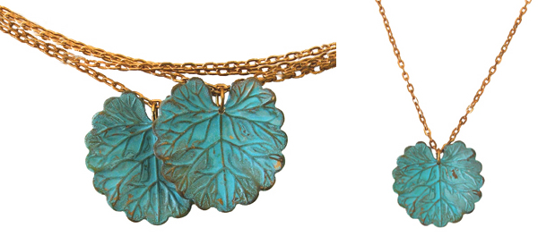
These necklaces with gorgeous green patina are from a lovely jeweler named We Dream in Colour. They’re made of brass with hand worked verdigris. That first necklace is especially nice because those pendants hang off the chain in a sort of off-center fashion lending an asymmetrical look. So cute. And affordable.
Naiad Twin Necklace, $75. Naiad Necklace, $32.

Strolling through ICFF last weekend, I have to confess that not much really impressed me. The display from Lumas, however, stopped me in my tracks. Just what I was looking for: affordable photography produced in limited editions.
Each signed and numbered photograph is a part of a limited edition and the photographers range from new talent on the scene, masters, classics and scientific photography. The gallery also offers some photos in open editions which are more affordable than the limited editions.
The photos can also be bought as is or framed and mounted. Firsthand, those options looked to be very well done. Also, the sizes of the prints offered provide a big impact… sizes range from approximately two feet square and larger.
The prints are absolutely stunning in person. I am loving this concept. Lumas has a brick and mortar gallery in Soho in New York that I’ll be sure to check out.
(I’ll be going over the rest of my ICFF picks later this week.)
Drift, David Burdeny. Edition of 150. $380.
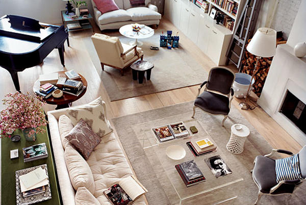
Caught Domino‘s Editor-in-Chief Deborah Needleman’s Tribeca home in this week’s New York Magazine and loved it so much. That living room is to die for and oh, dear the gray on the walls of her dining room is sublime. I love how everything looks so light and airy and yet so comfortable. See it all here. (And check out the rest of the issue… this week is the Home Design issue!)
Deborah Needleman's living room.

Anna Wolf‘s work employs tons of nature shots. Such beautifully lit shots. She does a lot of work for Urban Outfitters, as evidenced by her tear sheets. (via Whitespace)
From Anna Wolf's portfolio.