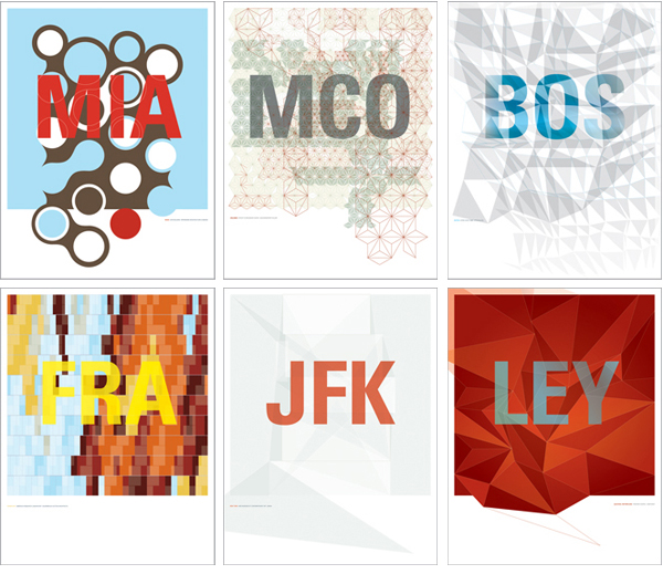
Grafik180:CityArt

Spied these limited-edition chromaprints from Publique Living in the summer issue of Blueprint and totally loved the graphic nature and the simple typography. The prints are a collaborative between Jean Orlebeke and Lian Ng.
From Publique Living: “Grafik180:CityArt is a series of artwork inspired by the distinctive architectural skin from buildings around the world. Whether it be a pattern or shape that distinguishes these buildings, it is the first layer of visual iconic recognition. The cities in which these buildings reside in are called out by their airport code instead of their names, creating another layer of graphic distinction, akin to the visual alignment between architectural skins and buildings. The codes also function as a beacon of destination, proclaiming the cities’ association with inspiring architecture.”
Such a great gift for architecture and design aficionados.
Miami's COR Building, Orlando Epcot's Spaceship Earth, Boston's Upper Crust Pizza, Frankfurt's Biberach Research Laboratory, New York's New Museum of Contemporary Arts and Lelystad's Theater Agora. $325 each, PubliqueLiving. Each print is a limited edition of 180 and comes framed.
I really want to send you an invite to my launch party, but don’t have your e-mail. If you are intersted I would love to hear from you
September 6th, 2007This would be great in a brick urban loft or apartment! I love prints, but I am still partial for canvas prints.
September 6th, 2007